Thursday, June 2, 2011
What HIV & AIDS Look Like Today
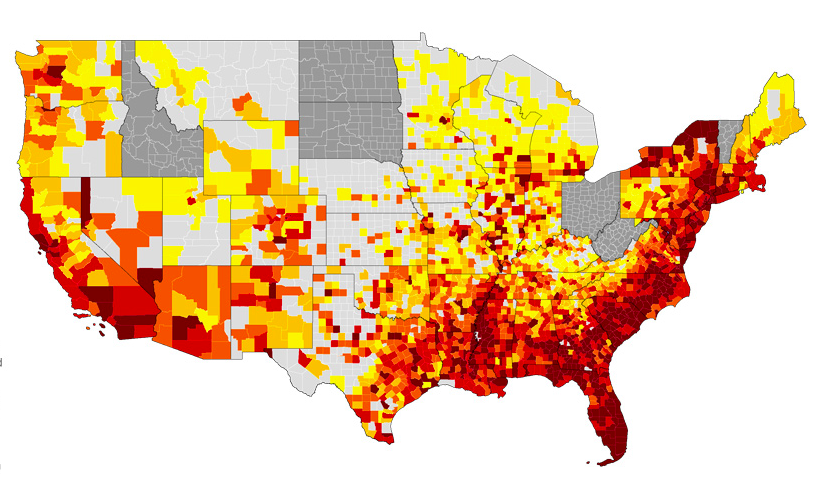
The above map is an illustration of what HIV/AIDS looks like today. To clarify, the darkly colored areas are places with high infection counts. Glance over the map and then take a few minutes to see the actual data on the interactive map over
here
.
No comments:
Post a Comment
Newer Post
Older Post
Home
Subscribe to:
Post Comments (Atom)

No comments:
Post a Comment